Wednesday, November 17, 2010

Week 12 - Frustrating Forms

If you've been browsing the Web for more than a day, you've used a form. Whether it's registering for an account, completing a purchase, or leaving a comment it seems like most sites have at least one form. The first thing I remember doing on the Internet was doing a search for Cartoon Network: entering a search term into a text box and clicking the submit button.

But if you've been browsing the Web for a while you've probably run into a form that made things difficult. The following things really grind my gears when I'm trying to fill out a form:

"What do you want?"
The label for this form input doesn't make sense. It's either too brief to be clear or the wording is just confusing.

Make form labels as clear as possible by:
  • Avoid using jargon (unless it's jargon your target audience is familiar with)
  • Use verbs or sentence completion
  • Use complete questions or phrases
  • Clearly differentiate form fields asking for the same information but for a different reason
    For example: shipping information vs billing information
"What do you mean it's wrong? What's wrong with it?"
The form won't let me submit but doesn't tell me why. Yes, the phone number field turned red but since I put in a full phone number I don't know why it isn't accepting it.

Help users enter information correctly by:
  • Placing any formatting requirements next to the input
    Example: xxx-xxx-xxxx or "no dashes, dots, or spaces - numbers only"
  • Place an example in an input field that would otherwise be empty
  • Consider adding code that formats the user's input for them
Related item: Tell the user their input is wrong after it loses focus. It can be irritating to reach the end of the form and find out half of it is wrong.

This is probably just me but...
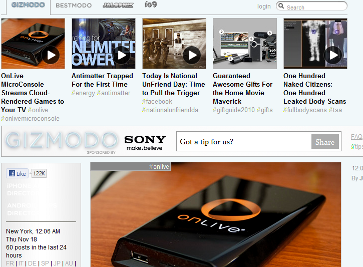
Quick! Where's the search on this site? (Click for large image)
Photobucket

If you picked the larger text input to the right of the Sony ad then, congratulations! You have the same dis-function that prevents me from realizing that the text "Got a tip for us?" does NOT mean "Hey, this is a site search!" But maybe it makes sense to make that form more prominent. The regulars on the site are probably used to it.

The search form is actually the small on at the very top of the page to the right of the word 'login'. Wait, what? Is it me or does the login link end up looking like it's the label for that text box?

Placing form elements (or entire forms) in unexpected places or placing them too close to unrelated content can confuse people like me.

Avoid this problem by:
  • Clearly separating forms from regular page content
  • Clearly separate forms from each other if there's more than one on a page
  • Follow conventions: if most sites place an element in a certain location then do the same thing
To be fair, Gizmodo did follow convention by placing the site search in the upper-right hand corner. (I wasn't being sarcastic when I said this is probably just me.)

It broke, now what?
The form tries to submit but it fails. It either hangs there trying to reach the next page or it goes to an indecipherable error page. It may even crash the browser entirely. In any case the user has no idea whether the information they entered got to where it was supposed to go.

I'm not going to put a list of how to prevent this; it isn't something that's necessarily in your control as a web developer and that isn't the point anyway.

What I'd like to see is an error message that makes sense for the user and instructions for what to do now. "An error occurred while processing your transaction. Please contact [DEPARTMENT] at xxx-xxx-xxxx or help@company.com" If it's known that a certain kind of error only prevented the next page from coming up but the order when through put that on the error page. If it definitely means the order failed say that. (Is it even possible to know? If so, that'd be awesome.) Put instructions on what to do if the submission hangs in your Help section.

A "Whoops, we don't know what happened" is better than nothing.

Monday, November 8, 2010

Week 11: Responsive Web Design

Something awesome happened at work last week.

During our team meeting our manager said that we would move forward with using some of the new features in HTML5 and CSS3 even though not everything is supported in every browser. We're not just letting go of pixel-perfect similarity between browsers, we're not worried about having the exact same visual effects and features. Instead of designing everything for the least capable browser the templates will be designed based on what's possible in modern browsers. Furthermore, the sites will be designed for multiple devices.

It's the most exciting thing since we dropped support for Internet Explorer 6 and I'm not even a designer.

So it seemed like rather good timing that J. Cornelius (VP of Operations at Coffee Cup and President of the Atlanta Web Design Group) came to speak to our class that same week and touched on the same thing.

Why is this good?

  • Less time spent tweaking
  • Deliver the best possible design regardless of browser
  • Deliver design meant for mobile
  • Things that are used are kept and improved
  • More pressure on browsers to adopt standards
I won't dwell on the first item since I've already ranted about it in a previous post. But the point made by John Allsopp earlier and reiterated by Cornelius last week applies to the second item as well: most people only use one browser. The person using IE7 doesn't care that the person using Opera or Firefox gets rounded corners and a different font. However, the people using Opera and Firefox will like how nice sites look that make full use of the standards those browsers support. There's really no reason those users should get less than what's possible.

But let's say for a second that a lot of people do use multiple browsers. If they have a browser the site looks better in wouldn't they just use that one rather than complain that the other browser doesn't show all the same stuff?

A lot of people already design for mobile but sometimes what happens is that a separate version of the site is built for mobile devices. Using CSS to make the existing site adjust for different devices will make maintenance much easier.

Another point is that it is important to use the new standards in order to keep them around. The W3C abandons things that aren't implemented by the browsers and the browser companies won't implement things unless there is pressure to do so. We can't wait for every browser in existence to support something to use it because that will never happen. While we're waiting for more support, W3C and the browser companies see little to no interest and the existing support gets dropped.

The major browser companies are using the W3C standards and the modern versions of their browsers have some level of support for HTML5 and CSS3. Since the browser wars are no longer about whose interpretation of the standards is correct the browsers have to compete based on who delivers the best experience. If a lot of sites start using something that's only supported by Mozilla that pressures the other browser companies to implement it as well.

Example Sites

Amped - Amped is the hack day that wrapped up Web Week in Atlanta. Currently, if you look at it in Firefox (3.6.4) you get the gradient background with the circular stripes. You don't see the stripes in Opera (10.63) but you do still see the effects with the font and text. In IE9 (9.0 beta) you lose the background stripes and font/text effects (but still looks cooler than how it does in IE6).

Robot or Not - This is the site our manager showed us right after coming back from An Event Apart (the conference put on by A List Apart). Designed by Ethan Marcotte, it is an excellent example of a site that adjusts to different browser window sizes.

More Information

A List Apart: Responsive Web Design

The Big Web Show: Episode #9

Responsive Web Design presentation on SlideShare

Wednesday, November 3, 2010

Week 10: My Thoughts on a SpoolCast episode

SpoolCast talked to Luke Wroblewski back in October in an episode titled "Luke Wroblewski and Innovations in Web Input" (transcript available).

As the title suggests, they discussed some of the newer ways forms are handling user input and the newer ways users are able to input data. The main topics in the interview (in order):

  • Google Instant Search
  • Yahoo's experience with a similar product "Live Search"
  • Other sites using different versions of this search
  • Input from anywhere
  • Ping for iTunes

It's a good interview where many good points are made but there were three that stood out for me.

A feature added to your site should solve your specific problem

Google's Instant Search may be cool and useful but that does not mean that every web site should change their search to do the exact same thing in the exact same way. An instantaneous* response can backfire. The example given in the interview was a form immediately throwing an error when the first character for a user name was entered because 'L is not a user name'.

As a counter-example some registration forms, like the one for Twitter,  put indicators next to the password field indicating their strength. As you type in the password and add in characters that meet the requirements (numbers, symbols, mixed case) the indicator goes from red and 'weak' to green and 'strong'. You know that your password is good enough as you're typing it: not after you've attempted to submit but you're not being interrupted by an error message either.

New features should help the user do what they need to easier and faster without frustrating them. This means doing some research and user-testing even when it's not something you're building from scratch.

Keep It Simple, Silly

Not a new lesson but sites like Facebook and LinkedIn are helping other sites let their users skip the registration process entirely. Services like Facebook Connect lets you log into an entirely different site using your existing account. The third party site avoids losing the user in the registration process, Facebook increases the value of their service to the user, and the user doesn't have to do anything other than log in to use the third party site.

Manage and Meet User Expectations

If Luke Wroblewski's opinion of Ping is typical of the people who used it then it seems that most of the problem was that people got something other than what they expected. Wroblewski was expecting his Ping account to pull information from his iTunes account but it didn't. He was also expecting it to work the way most other social sites do where there is very little limitations on what name or photo you use and no limit to what you can say that you like.

Part of this could have been avoided if people had known that their Ping accounts wouldn't be pre-populated with any data. User expectations can be managed by explaining what a new service will have, do, and be used for when it's announced. Demos are a good idea: they can make it clear what a service can't or won't do. I don't know what Apple did or didn't do with Ping before it was launched so this isn't to say that they didn't do any of this.

But another thing to do is to meet user expectations. I've honestly never heard of a social site or service that required you to not just use your real name but use it exactly how it appears on your credit card. I've also never heard of one that requires you to submit your user image for approval first. That's just odd. If they really didn't want to bother with having moderators check for anything inappropriate they could have just done what AdultSwim did and have a set of images for users to choose from.

This is all just my opinion and certainly not a substitute for listening or reading the interview so check it out if you haven't yet.

*I know people use the term "real time" but it sounds odd to me for anything that doesn't use some kind of alternative timing. We're not talking about an awards show on a 30 second delay or a video game where 3 minutes in real life is an hour in the game. We're talking about web sites. It'd be like getting on a slow elevator and saying, "I wish this elevator could get me to my floor in real time!".

See how that doesn't make sense? Clearly it wouldn't even be an elevator at that point but a teleporter.

Wednesday, October 20, 2010

Week 6 - Getting Access

All people, regardless of any condition they may have that affects how they use a computer, should be able to use web sites. Poor development and design decisions can prevent that. We should all want to build accessible web sites because it's the right thing to do but that is not enough motivation for everybody. Some people think that making web sites accessible is too much work and not worth the effort. So here are 3 selfish reasons for making sites accessible.

  1. It's good business
    19.3% of the United States population in the year 2000 had some kind of disability. 17% of adult Americans report having some hearing loss. While not everyone who falls in the first 19.3% necessarily has a condition that affects how they use the Internet that is still a large number of people to ignore as potential customers. Would you have your sales people refuse to describe a shirt to a blind customer in your store? Then why do that with your web site?

    "The ADA prevents that anyway" you say. I say that's a next segue for my next point: not making your site accessible could get you sued. Target ended up settling a lawsuit brought forth by the National Federation of the Blind for 6 million dollars because they were unable to use their site. Target's settlement with the NFB also required that they make the site accessible.

    If you don't care about increasing your customer base you should at least care about covering your butt.

  2. One day it could be you
    Think about the amount of time you spend online and all the sites you like to visit. Now think about how you'd feel if you suddenly couldn't use most of those web sites anymore or if the number of sites you could use got smaller over time.

    Not everyone who has a disability was born with it. Some people developed impairments with age. Some were caused by injury or illness. You might not care about sites being accessible now but you will when your short term memory won't hold onto which page you just visited, that artsy site becomes harder to read, that episode of your favorite show becomes harder to hear, and moving the mouse gets that much more painful.

    Unless you're planning on becoming completely disinterested in the Internet at some point.

    It's worth noting that while I keep using the word 'disability' there are things that affect your vision, hearing, cognitive abilities, and/or mobility that aren't considered disabilities, at least not by the general population.

    It's also worth noting that you're probably taking advantage of things that done for accessibility already and not just on the web. (Sliding doors anyone?)

  3. Professionalism
    Just like coding to standards, making your sites accessible is just the right way to do it. If you want to be perceived as a professional in the industry then your sites will work for 100% (or as near to that as possible) of the population, not just 80%.

    Some of this should happen anyway without the client asking for it, like alternate text. A lot of it will require input and/or permission from the client like the color scheme.
These aren't the only reasons but they're the best ones I could think of for anyone for whom appealing to their better nature doesn't work.

Useful Links

W3C Web Accessibility Initiative - "[Develops] strategies, guidelines, and resources to help make the Web accessible to people with disabilities."

United States Section 508 Guidelines - Web sites for federal agencies must follow these guidelines as well as state and local agencies that receive federal money.

WebAIM - Web Accessibility in Mind has a lot of information on the subject like this article on cognitive disabilities and the web but they've also created a tool to help you check that your sites are accessible called WAVE and it's free.

Think Vitamin's Videos on Accessibility - Think Vitamin recently made all of their videos on accessibility free forever.

Vischeck - This site has two useful tools. The first, Vischeck, is a color-blindness simulator that allows you to see what an image or web page looks like for someone with one of three different types of color blindness. The second, Daltonize, alters the colors of an image so that someone with colorblindness can still see the same contrast as in the original image.

Color Scheme Designer - 4th link in the utility navigation at the upper right is Vision Simulation and it has 8 different conditions that affect how someone views color. It's a good way to make sure that your palette has sufficient contrast for those that don't have normal vision (which according to this site is over 10% of the population).

Friday, September 10, 2010

Week 4: Personas

I happened upon this randomly. The Consumerist linked to a comic about e-mail marketing and I found this while browsing the archives. It's a comic created by Brad Colbow for Think Vitamin:

How to Understand Your Users with Personas

Wednesday, September 8, 2010

Week 3: Web Standards

It is very important to have standards. We have standards of weights and measures. There's agreement on how long a foot is and how much a pound weights. There are industry standards. You don't have to worry about electronic devices only working with one kind of wall outlet (at least not until you go overseas). There's even standards for the weight of yarn.

So why not use standards for the web?

There are already plenty of articles explaining why web standards are good and necessary. The main reasons are:

Maintenance and Production: It is easier and faster, and therefore cheaper, to create a web site that uses standards than to create a site specifically for one browser using proprietary code (or worse, a different site for each browser).

Accessibility: You can make your site more accessible by coding to standards. This is usually stated in reference to disabled users but will also help those hampered by older technology or slow/limited Internet access.

Search Engine Optimization: Other things being equal, a site with valid code is ranked higher by Google than a site with invalid code.

Professionalism and Quality: If you're a web developer writing standard code shows that you know what you're doing. You want to be seen as someone who is current on industry standards, technologies, and best practices. If you own the site then you don't want your site to flat out break in other modern browsers even if it isn't the one most of your target audience.

There are more of course: page weight, re-usability of the code, etc. but these are the reasons I see given the most often. They're also the reasons that both the developer and site owner will care about.

So are there any arguments against using web standards? I didn't really find any articles railing against standards but here are two reasons I've heard not to bother with them.

Tables are easier than using CSS
If browsers would support the multi-column layout module I would just say that this statement is false and move on. But since this is not the case then it may be true in production depending on your comfort level with CSS. But once the site is in maintenance you're in trouble and here's why: the client can't see the table, they only see space.

I can GUARANTEE that eventually the client is going to ask for content to be added someplace that is going to break the template because there is space there. They can't see that putting a wider banner in that cell is going to throw off the spacing for the entire table. They can't see that the change they're requesting is going to require adjusting all of the colspans and rowspans in the table. They only know that they are being quoted/charged an awful lot of money for what looks like a very simple change.

The site has to look exactly the same in every browser so it's OK to make the developer write hacky code.
No.

No, no, no, no, no.

No.

And also no.

I'm going to quote/paraphrase John Allsopp here and say that a site does not have to look exactly the same in multiple browsers because most people don't use different browsers on a regular basis. At worst, for the average non-web designing user, they might be using IE6 at work because they have to and a different browser when they use a mobile device. But no one expects sites to look exactly the same on a mobile device as they do on a computer and since IE6 is not a modern browser there can't be a reasonable expectation for things to even work in it, much less look the same as they would in IE8 or FF 3.x.

Yes, I did say earlier that you don't want your site completely broken browsers other than the one used by the majority of your users but there's a difference between the template being broken and something being 5 pixels farther to the left in IE than it is in FF.

Side Note:
OK, how ridiculous is this? Apple has an HTML5 showcase but blocks you if you try to view the demos in anything other than Safari. *facepalm*
Found via an article in InfoQ.

Monday, August 30, 2010

Communication - Harder Than It Looks

Our professor showed this two minute clip on YouTube of a guy attempting to explain what an Information Architect is and does. It's a funny video. The woman keeps thinking that any other job he mentions in his explanation is what he does until he gives up and says, "Sure, why not?" to her last guess.

But let's be honest here there were problems on both sides of that conversation.

It starts out OK. She asks what he does and he says he's an Information Architect. Most people are after your job title when asking that question so no problem here. But once she asked if he was "like an architect, but" it was clear she had no clue what an IA does. At that point he should have given the simplest and most complete answer possible. Again, I like the one given by the The Information Architecture Institute since it doesn't use any jargon.

Instead, he only gives bits of information that don't really answer the question. She then starts guessing at what he does. When he does explain what an IA does he uses a bunch of terms she doesn't understand. So she guesses again and he gives up.

For her part, it makes absolutely no sense to guess that he does any other job he happens to mention. The "do you work in fashion" part came across like she was purposefully being difficult. However, I'm sure she felt the same about him when he said he isn't a designer and then described his job in terms of designing something.

I bring this up because one of the things that has been brought up multiple times in our classes is that IT communicates poorly with the rest of the business. I think that this works as an example even if he isn't actually in IT.